Read to find out how Sonic the Hedgehogs design was made!
Read to find out how Sonic the Hedgehogs design was made!

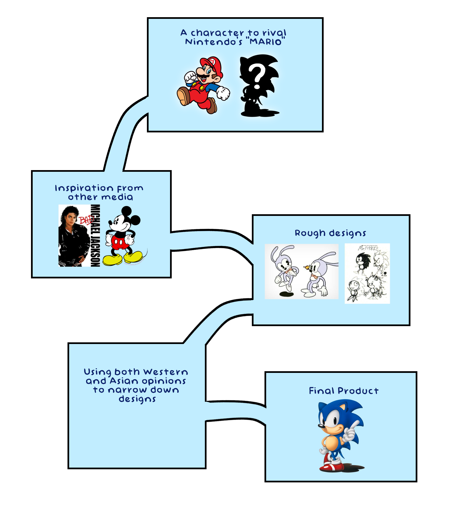
The design of Sonic the Hedgehog, one of the most iconic video game characters in history, evolved from a combination of creative direction, technological limitations, and cultural impact. Sonic was originally created by Yuji Naka, the lead developer at SEGA, and artist Naoto Ohshima in the early 1990s to compete with Nintendo's beloved mascot, Mario. The design process for Sonic was focused on creating a character that was visually distinct, full of unique personality, and appealing to both children and adults.
The first goal was to create a character that represented speed, an important feature for the gameplay of the Sonic games. Sonic needed to have a design that could convey his super-fast movement. Ohshima’s early concept art included several animals, such as; a beetle and bunny, but ultimately, a hedgehog was chosen for its potential to emphasize speed and agility, while also offering a unique and fun contrast to the more traditional, slower animals in other games.
The next step was designing Sonic’s physical appearance. His bright blue color was chosen to make him visually stand out on the screen, especially in the colorful environments of the games. The decision to give him spiky quills was based on the idea that the spikes would symbolize speed, as they looked like they were in motion, even when the character was standing still. Sonic’s eyes, a notable feature, were designed as large and expressive. Ohshima also initially considered giving Sonic human-like eyes, but ultimately decided on large white eyes with a black outline to maintain a more animalistic look while still displaying emotion. This helped make the character more relatable and animated.
Sonic’s red shoes became one of his signature features, inspired by the iconic red sneakers worn by Michael Jackson in the "Bad" music video, as well as by the concept of speed. The shoes were designed with a sleek, aerodynamic look that reinforced the idea of motion. They were also practical, serving to balance Sonic's design with an aesthetic that looked fast but still grounded in a recognizably human style.
Sonic’s facial expressions played a crucial role in conveying his cocky and rebellious personality. The character was designed with a cocky grin and a confident posture, setting him apart from other, more traditional heroes. His design needed to show that he was a character with an attitude, one who was not just fast but also daring and full of personality.
Once the character design was complete, it went through a series of refinements and adjustments to ensure that Sonic worked well in the game world. This included ensuring that his design could be easily recognizable even at a small size, given the limitations of early gaming hardware. His simplified shape helped maintain clarity, and the bold color palette made him stand out against the backgrounds. The design was also created with a focus on animation, as Sonic needed to express his personality and movement in a smooth and dynamic way during gameplay.
Sonic's design was instrumental in his success. He became a symbol not only for SEGA but for the entire gaming industry during the 1990s. His rebellious attitude, combined with his sleek, dynamic look, helped define a generation of gamers. Sonic’s appearance influenced not only future video game characters but also shaped how game design could emphasize personality and style. In conclusion, Sonic the Hedgehog's character design process was a delicate balance of creative vision and technical constraints. From choosing a hedgehog as the base animal to refining his visual identity with bold colors and expressive features, every detail contributed to Sonic becoming an enduring icon in the world of gaming.